This weekend I decided to take a little stroll around SharePoint Online. I had poked around the Team Site template already but I was really curious about how a publishing site would behave. So, I went ahead and created a site using the Publishing Template.
The root site I was working from was created using the Team Site template and from there I clicked on
Site Actions >
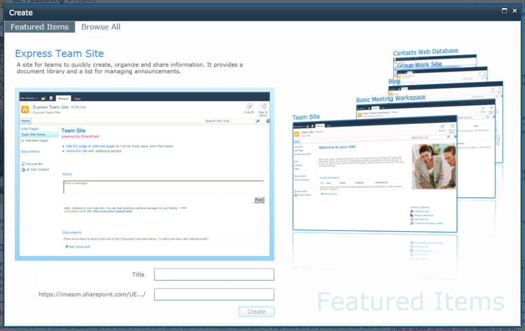
New Site. Up popped a new site creation dialog with a nice carousel effect, allowing you to scroll through a set of “Featured” templates. The templates that they choose to feature were focused on collaboration, communication and contact management. Which is inline with what I would expect when targeting small to medium size businesses wanting to consolidate these aspects of their business.
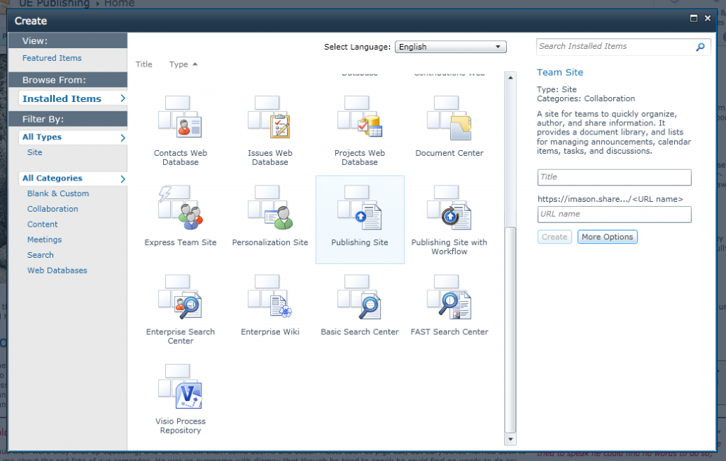
What I did not see was the Publishing Site template in this section. So, I selected the “
Browse All” tab and the view changed to the familiar Create Site dialog that listed the available Site Templates that one would normally see in SharePoint 2010. I scrolled down to select the “
Publishing Site” template, and happily created my site, vaguely wondering if I would see the Adventure Works logo or not when it was done. A second or two later the page refreshed….and…well, this is what I saw:
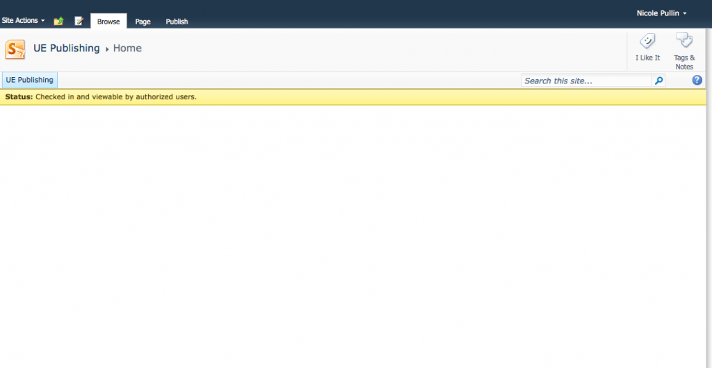
You are presented with what appears to be a completely empty Team Site. Nothing is quite as terrifying as staring at a white, blank page, especially if you are potentially working with a new system. I was hoping that Microsoft would have taken this opportunity to add some welcoming help content as a way to guide people through the experience. What would have been nice to see here was a bit of an explanation about how to get started with SharePoint. How to edit and publish a page, what a web part is and how to add one, or explain the difference between a site and page. Essentially information that someone new to SharePoint might find useful or necessary.
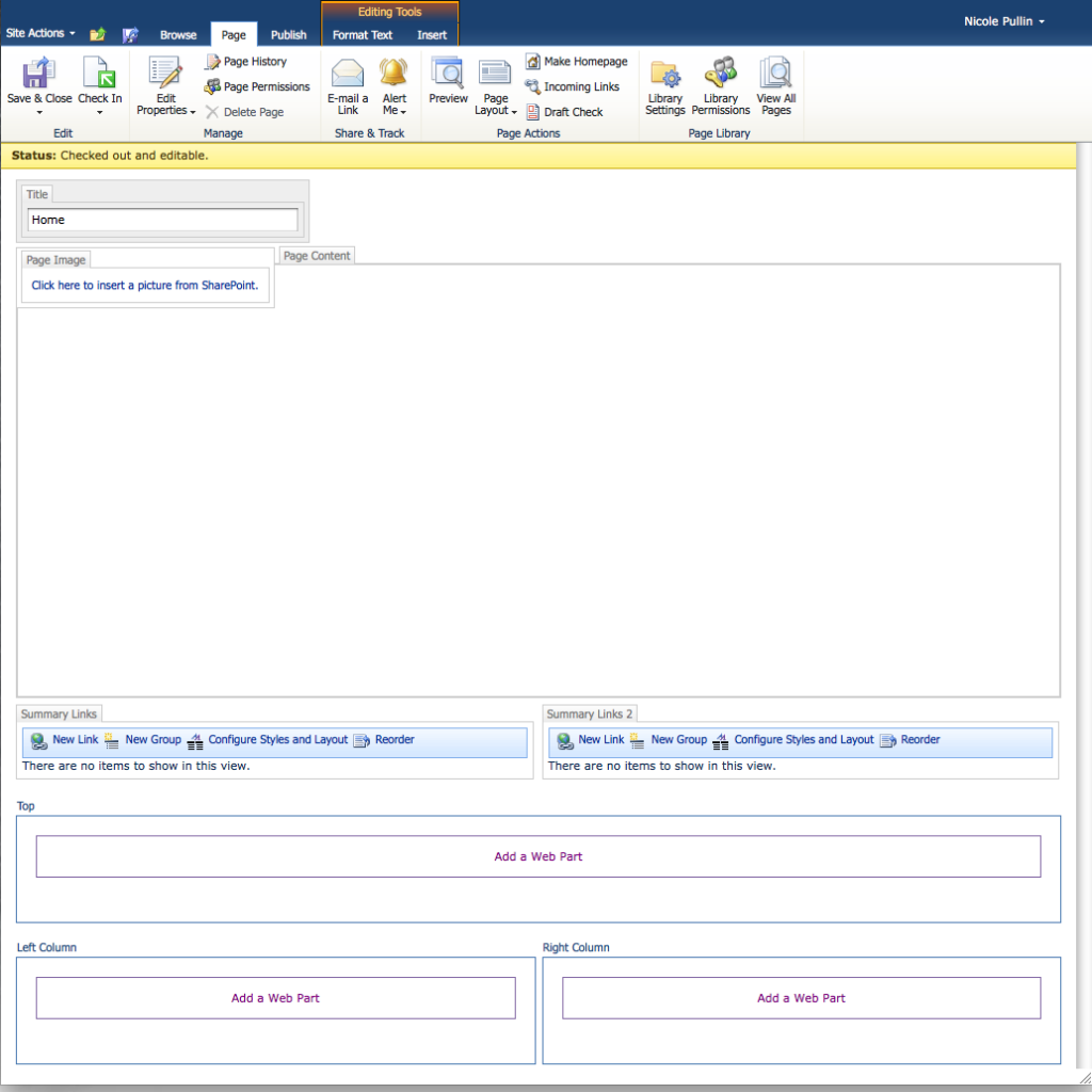
Now that I have determined that the publishing template simply creates a Team Site with the publishing features turned on, I dove in and started editing the page. I was curious to see if anything had changed from a page layout perspective. Once in edit mode, everything looked like it normally would right down to the fact that the
Welcome Links page layout was the default used when you create a new publishing sub site.
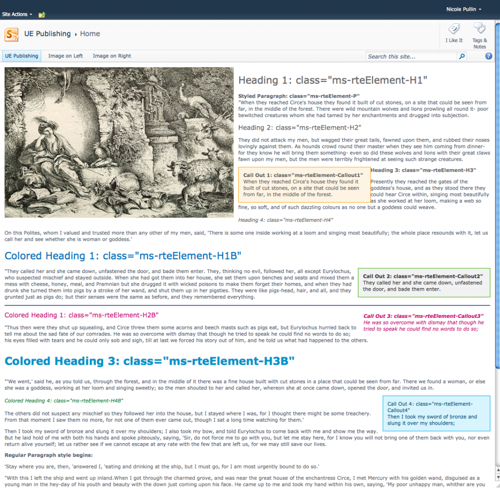
I added some content to the page to test out the built in styles like the headers and callouts. Everything looked pretty standard and the classes that are applied are consistent to what are being used for SharePoint 2010. This makes me happy since I already have design patterns that target these classes and structure.
The next thing I did was create a new page. I found it curious that it used the
(Welcome Page) Table of Contents page layout as the default page layout. I can’t imagine that being very useful for people that have chosen to create a publishing site. I mean, how many table of contents pages does a site actually need? So, I went ahead and changed the default page layout to something more useful for a publishing site, the
(Article Page) Body only page layout.
And…that’s where I stopped for the night.
Conclusion
My first impression is that SharePoint Online is very much targeted for the quick creation of collaboration sites. Unfortunately the power of the publishing infrastructure, upon which a rich Intranet experience can be built, is not immediately evident. Imagine how improved the initial experience could be for people that have never used SharePoint before if there was a guided process to help introduce them to the power of the platform upon the creation of a site.
I will be certain to share more thoughts, tips and tricks as I dive deeper into SharePoint Online.

 What I did not see was the Publishing Site template in this section. So, I selected the “Browse All” tab and the view changed to the familiar Create Site dialog that listed the available Site Templates that one would normally see in SharePoint 2010. I scrolled down to select the “Publishing Site” template, and happily created my site, vaguely wondering if I would see the Adventure Works logo or not when it was done. A second or two later the page refreshed….and…well, this is what I saw:
 You are presented with what appears to be a completely empty Team Site. Nothing is quite as terrifying as staring at a white, blank page, especially if you are potentially working with a new system. I was hoping that Microsoft would have taken this opportunity to add some welcoming help content as a way to guide people through the experience. What would have been nice to see here was a bit of an explanation about how to get started with SharePoint. How to edit and publish a page, what a web part is and how to add one, or explain the difference between a site and page. Essentially information that someone new to SharePoint might find useful or necessary.
Now that I have determined that the publishing template simply creates a Team Site with the publishing features turned on, I dove in and started editing the page. I was curious to see if anything had changed from a page layout perspective. Once in edit mode, everything looked like it normally would right down to the fact that the Welcome Links page layout was the default used when you create a new publishing sub site.
 I added some content to the page to test out the built in styles like the headers and callouts. Everything looked pretty standard and the classes that are applied are consistent to what are being used for SharePoint 2010. This makes me happy since I already have design patterns that target these classes and structure.
 The next thing I did was create a new page. I found it curious that it used the (Welcome Page) Table of Contents page layout as the default page layout. I can’t imagine that being very useful for people that have chosen to create a publishing site. I mean, how many table of contents pages does a site actually need? So, I went ahead and changed the default page layout to something more useful for a publishing site, the (Article Page) Body only page layout.
And…that’s where I stopped for the night.


