Lesson 1: It is easy to create a variety of looks using the out of the box (OOTB) options available, but none of them made me do a double take
The instant I saw the white, blue and blah default Office Template look I knew I had to change it. I headed over to “Cog Icon > Site Settings > Change the look” to see what my options were and I was surprised to see some playful themes. The first look I choose was “Sea Monster” because…well…it has monsters in the name, need I say more? The look was great for a day but then I found it distracting from the tasks I was trying to complete. So, I nixed it and spent quite a bit of time playing with the all of the looks. I spent hours trying multiple combinations of designs, palettes, fonts and MasterPages.It was time to stop playing around with combinations and create my own theme.
Lesson 2: When changing the background image of a Composed Look go with a larger image that does not need to be repeated
I headed back over to “Cog Icon > Site Settings > Change the Look” and selected the “Immerse” as my starting point. The first thing I did was change the background image to my own that needed to be repeated. I was 99% certain that a repeating image would not work, but I thought I would try it out and…yeah, it didn’t work. Instead the image was stretched to fill the viewport at 100%.

Lesson 3: Save your customized look in the Composed Looks list or you might lose all your hard work
The next step was to save my new look so I could apply it again later. I plan on playing with other looks which means I will lose these settings if I do not save them first. I was determined to see if I could do it simply through the interface and I was somewhat successful. How did I do it? Well let me show you:Step 1: Select “Cog icon > Site Settings” and click the “Composed Looks” link under the “Web Designer Galleries” heading
 Step 2: Select the “List” tab and click “Quick Edit”

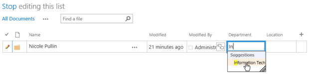
Step 3: The view will change to resemble an excel spreadsheet. Scroll to the bottom and copy the values that are stored under “Current”, give it a unique name and determine its sort oder (I made mine 1 so it would appear at the top of the first page)
 Step 4: Head back over to “Cog Icon > Site Settings” and select the “Change the look” link and you should see your new theme in the list!
 Now that I had my look saved the big question was if the sub sites would inherit the new design. I navigated to the test publishing sub site I had created and that inherited the new theme but unfortunately the team sub site did not inherit the design. You also do not have the option of selecting the new look you just saved in your root site level.
Parting Thoughts
The Good- Overall I like the new design with its emphasis on typography as a design element
- The introduction of some fun new built in looks is a refreshing change from a product that has a bit of a stuffy persona
- You can achieve a simple level of branding with no HTML skills by creating a large background image and using one of the predefined colour schemes, font schemes and site layouts
- Inability to easily create your own colour schemes without editing an XML file
- Team sub sites do not automatically inherit the looks created in the root level Composed Looks list
- Being forced to use a a large image that is scaled to the browser window